Statistics
Gain powerful insights into your work patterns, project distribution, and earnings through comprehensive visual analytics. The Statistics screen transforms your time tracking data into actionable charts and metrics, helping you understand where your time goes and how productive you've been.
Statistics screen overview
The Statistics screen is a scrollable dashboard displaying multiple visualization cards:
Header section
Period Selector:
- Shows current filter period (e.g., "current Year")
- Tap to change time range (same as task filtering)
- Options: All time, Today, current Week, current Month, current Year, etc.
Summary Metrics:
- Total Time: Right side, large display (e.g., "277h 41m")
- Total Earnings: Below time, dollar amount (e.g., "$ 13944.91")
- Filter Status: Shows active filters (e.g., "None" or project names)
Toolbar Icons:
- Filter icon: Apply filters to all statistics
- Plus (+): Quick actions
Key metrics cards
The statistics screen displays summary cards at the top showing your aggregated data:
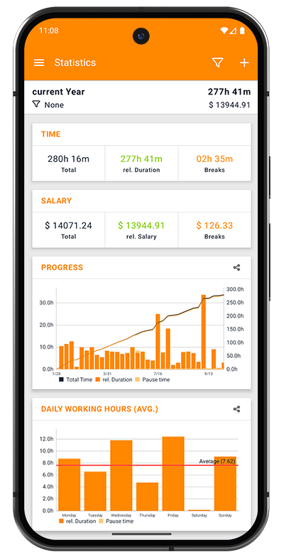
TIME card
Three metrics showing time breakdown:
- Total: Complete duration including breaks (gray, e.g., "280h 16m")
- rel. Duration: Actual work time excluding breaks (green, e.g., "277h 41m")
- Breaks: Total pause time across all sessions (orange, e.g., "02h 35m")
Understanding the Numbers:
- Total = rel. Duration + Breaks
- Use rel. Duration for billable hours
- Monitor Breaks for productivity insights
SALARY card
Three metrics showing earnings breakdown:
- Total: Gross earnings including all time (gray, e.g., "$ 14071.24")
- rel. Salary: Earnings from work time only (green, e.g., "$ 13944.91")
- Breaks: Theoretical earnings during breaks (orange, e.g., "$ 126.33")
Understanding the Numbers:
- Total = rel. Salary + Breaks
- Use rel. Salary for actual billable earnings
- Breaks shows potential earnings lost to break time
Chart visualizations
Each chart card includes a share icon (top right) for exporting the visualization as an image.
PROGRESS chart
Combined bar and line chart showing work patterns over time:
Bar Chart Elements:
- Orange bars: Total Time (includes breaks)
- Green bars: rel. Duration (work time only)
- Light/white bars: Pause time (breaks)
Line Graph:
- Shows cumulative hours trend over the selected period
- Helps visualize overall progress and growth
- Right Y-axis shows cumulative totals (e.g., "300.0h")
X-Axis:
- Time intervals (days, weeks, or months depending on period selected)
- Labeled with dates (e.g., "3/23", "4/13", "5/5")
Legend:
- Total Time (orange square)
- rel. Duration (green square)
- Pause time (white/light square)
Use Cases:
- Track productivity trends over time
- Identify busy vs. slow periods
- See cumulative progress toward goals
- Spot patterns in work/break ratios
DAILY WORKING HOURS (AVG.) chart
Bar chart showing average work hours by day of week:
Chart Elements:
- Orange bars: rel. Duration (work hours) for each day
- Red horizontal line: Average across all days (e.g., "Average: 7.62")
- Bar heights: Vary by day, showing which days you work more/less
Days Displayed:
- Monday through Sunday (left to right)
- Bars show actual hours worked (e.g., "8.0h", "12.0h")
Legend:
- rel. Duration (orange square)
- Pause time (light square)
Use Cases:
- Identify most/least productive days
- Balance workload across the week
- Spot patterns (e.g., lower Friday hours)
- Set realistic daily goals based on averages
PROJECTS chart
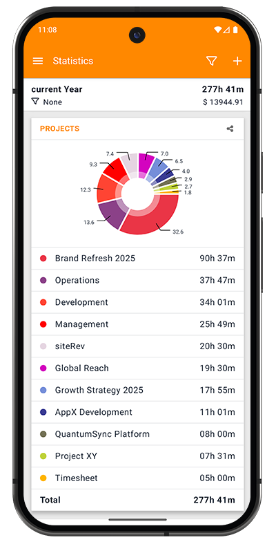
Donut chart showing time distribution across all projects:
Chart Elements:
- Donut/pie segments: Color-coded by project
- Percentage labels: Show proportion of total time (e.g., "32.6%", "13.6%")
- Center hole: Creates donut chart appearance
Project Legend: Listed below the chart with:
- Color indicator: Matches chart segment
- Project name: Full project title
- Time total: Hours and minutes for that project (e.g., "90h 37m")
- Total row: Sum of all project time at bottom
Sorting: Projects listed from highest to lowest time
Use Cases:
- See which projects consume most time
- Identify time allocation across clients
- Support client billing discussions
- Review project balance and priorities
- Export for client transparency reports
Additional visualizations
The statistics screen may also display (scroll down to see):
TAGS Chart:
- Similar donut chart format as PROJECTS
- Shows time distribution by tag
- Useful for analyzing work categories (meetings, development, etc.)
EXPENSES Chart:
- Bar chart showing expense totals
- Paid vs. unpaid breakdown
- Helps track reimbursement status
MILEAGE:
- Summary of travel tracking (if using mileage tasks)
- Total distance and related metrics
Filtering statistics
Apply filters to focus your analysis on specific data:
Filter Options:
- Tap the filter icon in the header
- Same filtering options as Tasks screen
- Apply filters by:
- Projects: Analyze specific projects only
- Status: Billable, Paid, Billed, etc.
- Type: Tasks, Mileage, Calls
- Tags: Filter by activity tags
Filter Indicator:
- Shows below period in header (e.g., "None" or project names)
- All charts update automatically based on active filters
Combining Filters:
- Use period + project filter to analyze one client's monthly work
- Combine status + period for unbilled work analysis
- Filter by tags to see time spent on meetings vs. development
Exporting charts
Share charts as images for reports, presentations, or documentation:
Export Process:
- Locate the chart you want to export
- Tap the share icon (top-right corner of the chart card)
- Chart is rendered as high-resolution PNG image
- Android sharing menu appears
- Select destination:
- Email to clients or accounting
- Save to Google Drive, Dropbox, etc.
- Include in presentations or reports
- Print directly
What Gets Exported:
- Complete chart visualization
- Chart title
- Legend
- All data labels and values
- High resolution suitable for printing
Export Uses:
- Client reports and invoices
- Internal team presentations
- Productivity reviews
- Financial documentation
- Portfolio showcases
Interpreting your statistics
Understanding trends
PROGRESS Chart Insights:
- Upward trend: Increasing workload or productivity
- Flat line: Consistent work pattern
- Downward trend: Decreasing activity (vacation, slow period)
- Spikes: Unusually busy periods or project deadlines
DAILY HOURS Insights:
- Above-average days: Your most productive days
- Below-average days: Consider workload distribution
- Zero-hour days: Weekends or days off
- Pattern recognition: Do you work more mid-week?
Performance indicators
Healthy Work Patterns:
- Consistent daily averages (not too high or low)
- Reasonable break percentages (5-15% of total time)
- Balanced project distribution (no single project dominating)
- Upward progress trend for active projects
Warning Signs:
- Very long work days consistently (burnout risk)
- Zero or minimal breaks (unsustainable)
- One project consuming >70% of time (lack of diversification)
- Erratic daily patterns (inconsistent scheduling)
Using data for decisions
Client Management:
- Projects chart shows which clients demand most time
- Compare time investment vs. revenue
- Identify clients for rate negotiations
- Spot scope creep early
Productivity Optimization:
- Daily chart reveals optimal work days
- Schedule important work on high-productivity days
- Balance workload across the week
- Set realistic daily time goals
Financial Planning:
- Salary metrics show earning trends
- Break analysis reveals potential earnings optimization
- Project distribution helps diversify income
- Track toward monthly/yearly revenue goals