Statistics
The Statistics page turns your tracked tasks into charts. You can see how your time and earnings break down by day, by project, and by tag over a date range you select.
Date range and filters
At the top of the page you set which data the charts use.
- Date range (top field): the period the charts cover.
- Comparison range (second field): an earlier period to compare against. The percentage change shown on each summary card compares the current range to this one.
Use the filter row to narrow the data further:
- Search: find tasks by text.
- Status and Type dropdowns: limit results by task status or task type.
- Project and Tag dropdowns: focus on specific projects or tags.
- Team member: show data for selected people.
- Feeling: filter by the mood set on tasks.
The Filter button shows how many filters are active. Use the +/- button to switch the comparison on or off.
Summary cards
Four cards sit above the charts and total the selected range. Each card shows a value and the percentage change against the comparison range, with green for an increase.
- Duration: total time tracked.
- Total: total earnings.
- Expenses: total expenses.
- Breaks: total break time.
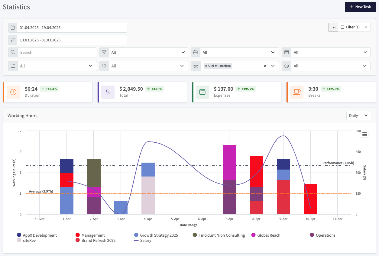
Working hours
The Working Hours chart shows tracked time per day as stacked bars, with one color per project. Read it like this:
- Left axis: working hours per day.
- Right axis: earnings (salary).
- Stacked bars: hours per project on each day. The legend below the chart maps each color to a project.
- Salary line: earnings across the range.
- Performance line (dashed, dark): your daily working-hours figure.
- Average line (dashed, orange): the average across the range.
Use the dropdown in the top right of the chart to switch the grouping (for example Daily).
Duration and salaries by project
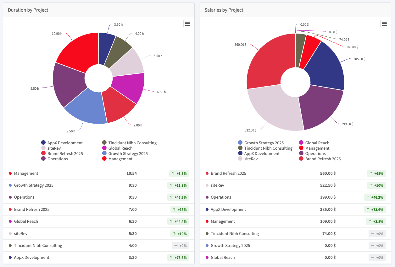
Two donut charts compare your projects side by side:
- Duration by Project: how your tracked time is split across projects.
- Salaries by Project: how your earnings are split across projects.
Each chart has a ranked list below it. Every row shows the project name, its value (hours or amount), and the percentage change against the comparison range.
Duration by tag
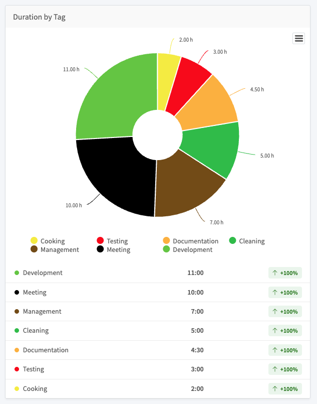
The Duration by Tag donut chart splits your tracked time by tag. The ranked list below shows each tag, its total time, and the percentage change against the comparison range.
Mileage and locations

The Mileage section sums travel distance for the selected range.
- Mileage: total distance from your tasks.
- Locations: select Download to export location data.
Exporting a chart
Each chart has a menu button in its top right corner. Open it to export the chart as an image (PNG or JPEG), a PDF, or a vector file (SVG).