Statistics
Gain powerful insights into your work patterns, project distribution, and earnings through comprehensive visual analytics. The Statistics screen transforms your time tracking data into actionable charts and metrics, helping you understand where your time goes and how productive you've been.
On this page: key metrics · chart visualisations · customising what shows · filtering · interpreting trends.
Statistics Screen Overview
The Statistics screen is a scrollable dashboard displaying multiple visualization cards. Each card focuses on a different aspect of your work data.
Screen Elements:
- Period Selector - Filter bar at the bottom to change time range
- Chart Cards - Scrollable list of visualizations
- Options Menu - Toggle which charts to display
- Chart Order - Customize card arrangement (Pro)
Use the same filtering options as the task list. Tap the period selector at the bottom to change the time range, project filter, or other criteria.
Key Metrics Cards
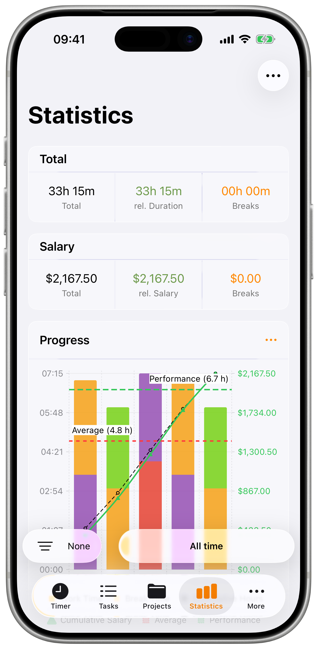
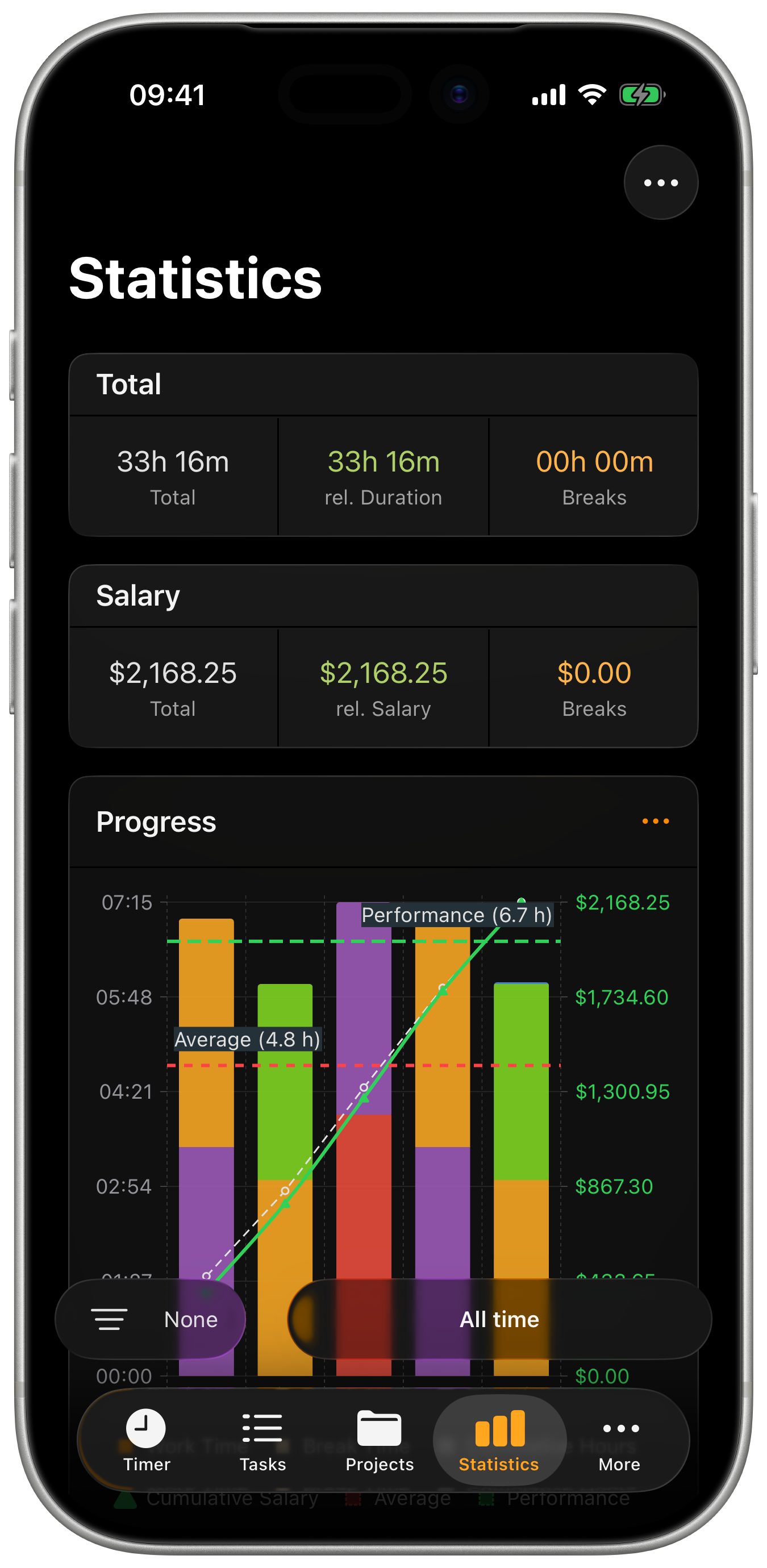
TIME Card (Totals)
Three metrics showing your time breakdown:
| Metric | Color | Description |
|---|---|---|
| Total | Gray | Complete duration including breaks |
| rel. Duration | Green | Actual work time excluding breaks |
| Breaks | Orange | Total pause time across all sessions |
Understanding the Numbers:
- Total = rel. Duration + Breaks
- Use rel. Duration for billable hours
- Monitor Breaks for productivity insights
Example:
- Total: 42h 30m
- rel. Duration: 40h 15m
- Breaks: 2h 15m
SALARY Card
Three metrics showing your earnings breakdown:
| Metric | Color | Description |
|---|---|---|
| Total | Gray | Gross earnings including all time |
| rel. Salary | Green | Earnings from work time only |
| Breaks | Orange | Theoretical earnings during breaks |
Understanding the Numbers:
- Total = rel. Salary + Breaks
- Use rel. Salary for actual billable earnings
- Breaks shows potential earnings during break time
The Salary card respects project-level salary visibility settings. If a project has salary hidden, it won't be included in these totals.
Chart Visualizations
PROGRESS Chart
Combined bar and line chart showing work patterns over time:
Bar Chart Elements:
- Colored bars - Hours worked per day/period
- Project colors - When "Show Projects" is enabled
- Stacked view - See project breakdown per day
Line Graph Options:
- Cumulative line - Shows total hours accumulating over time
- Average line - Your average hours per day
- Performance line - Average of days you actually worked
Chart Controls (tap menu icon):
| Toggle | Description |
|---|---|
| Show Totals | Display cumulative hours line |
| Salary | Show earnings instead of hours |
| Projects | Color-code bars by project |
| Average | Show average line across all days |
| Performance | Show average of worked days only |
Zoom Levels:
- 1 Week - Detailed daily view
- 2 Weeks - Short-term trends
- 1 Month - Monthly patterns
- 3 Months - Quarterly overview
- All - Complete period
Use Cases:
- Track productivity trends over time
- Identify busy vs. slow periods
- See cumulative progress toward goals
- Spot patterns in work/project distribution
WEEKLY CHART (Daily Working Hours)
Bar chart showing average work hours by day of week:
Chart Elements:
- Bars - Hours for each day (Monday through Sunday)
- Color coding - Work time vs. break time
- Day labels - Abbreviated day names
Insights:
- Identify most/least productive days
- Balance workload across the week
- Spot patterns (e.g., lower Friday hours)
- Set realistic daily goals based on averages
PROJECTS Chart
Donut/pie chart showing time distribution across all projects:
Chart Elements:
- Donut segments - Color-coded by project
- Percentage labels - Proportion of total time
- Legend - Project names with hours
Legend Information:
- Project color indicator
- Project name
- Total hours for that project
- Percentage of total
Use Cases:
- See which projects consume most time
- Identify time allocation across clients
- Support client billing discussions
- Review project balance and priorities
This chart only appears when viewing all projects. When filtering to a single project, it's hidden automatically.
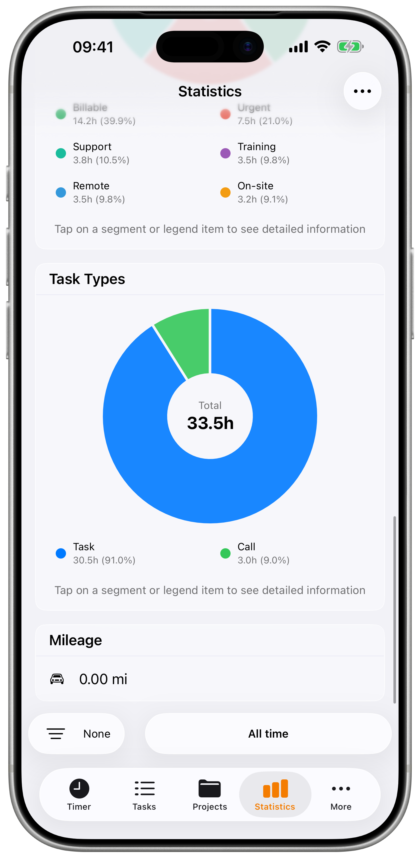
TAGS Chart
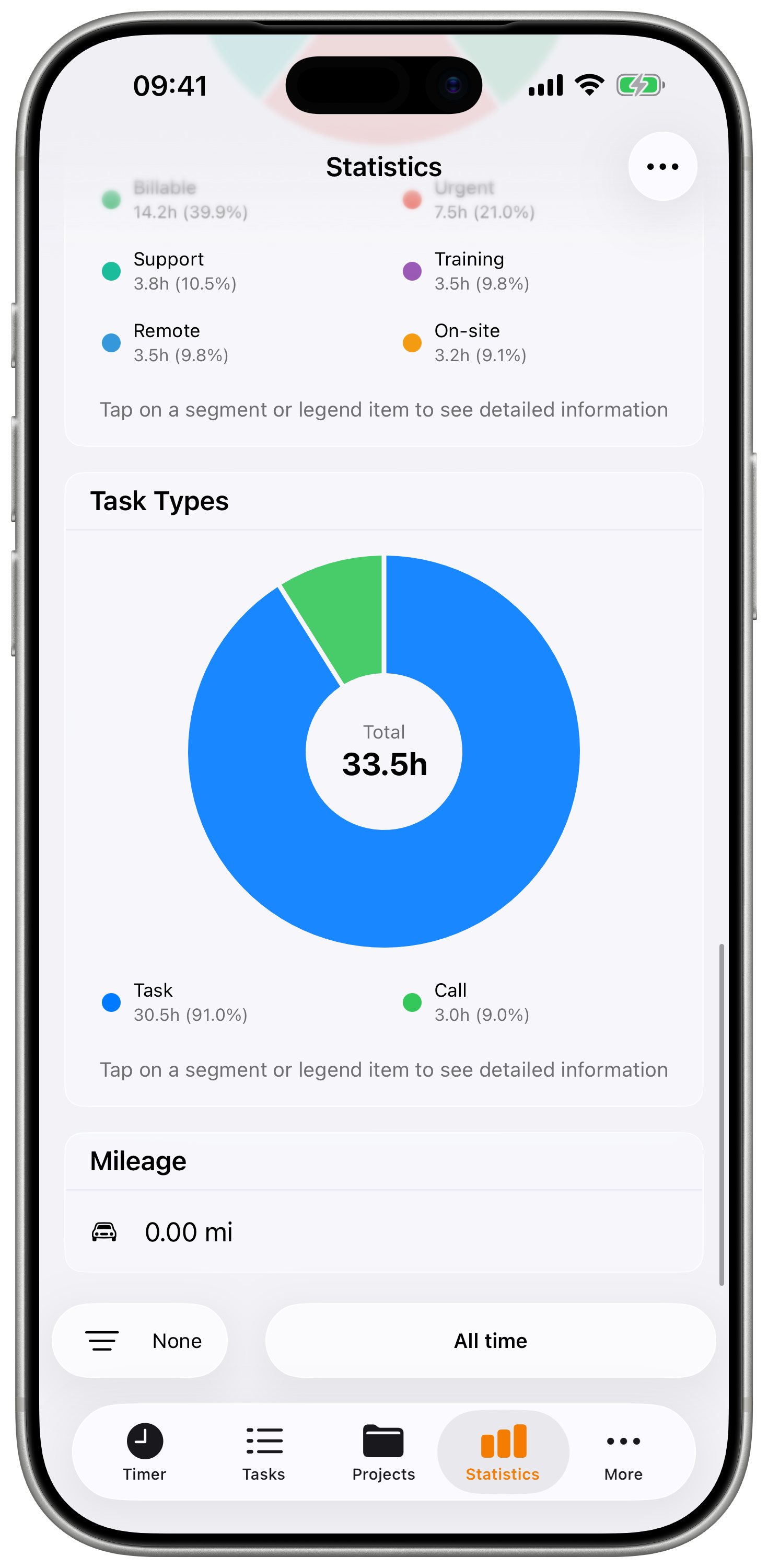
Donut chart showing time distribution by tags:
Chart Elements:
- Similar format to Projects chart
- Color-coded by tag color
- Shows tagged time only
Use Cases:
- Analyze work categories (meetings, development, etc.)
- Track time by activity type
- Identify where effort is concentrated
- Support resource allocation decisions
TASK TYPES Chart
The Task Types chart requires a Pro subscription.
Pie chart showing distribution of task types:
Task Types:
- Tasks - Regular time entries
- Mileage - Travel/driving entries
- Calls - Phone call tracking
Use Cases:
- Understand work composition
- Track travel time separately
- Analyze communication overhead
PERIOD COMPARISON Chart
Period Comparison requires a Pro subscription.
Compare current period against the previous equivalent period:
Comparison Metrics:
- Total Duration (current vs. previous)
- Total Earnings (current vs. previous)
- Average Daily Hours
- Break Duration
Visual Indicators:
- Green arrow up - Increase from previous period
- Red arrow down - Decrease from previous period
- Percentage change displayed
Supported Periods:
- Today vs. Yesterday
- This Week vs. Last Week
- This Month vs. Last Month
- This Quarter vs. Last Quarter
- This Year vs. Last Year
- Custom periods
Use Cases:
- Track improvement over time
- Identify seasonal patterns
- Monitor productivity changes
- Compare billing periods
MILEAGE Card
Summary of travel tracking (if using mileage tasks):
Displays:
- Total distance traveled
- Unit based on settings (km or miles)
- Icon indicator
Use Cases:
- Track travel for reimbursement
- Monitor driving for tax purposes
- Review travel patterns
AI INSIGHTS Card
AI Insights requires iOS 26+, a Pro subscription, Apple Intelligence enabled on your device, and at least 3 days of tracked data.
Get personalized insights about your work patterns powered by Apple Intelligence:
Features:
- Work pattern analysis
- Productivity recommendations
- Trend identification
- Natural language insights
How to Use:
- Ensure you meet the requirements
- Find the AI Insights card in Statistics
- Tap "Generate Insights"
- View personalized analysis
Customizing Statistics
Toggle Charts On/Off
Control which charts appear:
- Tap the menu icon (three dots) in the toolbar
- Toggle individual charts on/off:
- Total
- Salary
- Progress Chart
- Weekly Chart
- Projects Chart
- Tags Chart
- Task Types (Pro)
- Period Comparison (Pro)
- Mileage
- AI Insights (iOS 26+, Pro)
Reorder Charts
Chart reordering requires a Plus or Pro subscription.
Customize the order charts appear:
- Tap menu icon → Chart Order
- Drag charts to reorder
- Most important charts at top
- Changes save automatically
Filtering Statistics
Apply filters to focus your analysis:
Filter Options:
- Time Period - Today, Week, Month, Year, Custom
- Projects - Specific projects only
- Status - Billable, Paid, Billed, etc.
- Type - Tasks, Mileage, Calls
- Tags - Filter by activity tags
How to Filter:
- Tap the filter bar at the bottom
- Select your criteria
- All charts update automatically
Filter Combinations:
- Period + Project = Analyze one client's monthly work
- Status + Period = Find unbilled work this month
- Tags + Project = See meetings for specific client
Interpreting Your Statistics
Understanding Trends
PROGRESS Chart Insights:
- Upward cumulative line - Growing total hours
- Flat bars - Consistent daily work
- Spikes - Unusually busy periods
- Gaps - Days without tracking
WEEKLY Chart Insights:
- Highest bars - Your most productive days
- Lowest bars - Potential scheduling opportunities
- Weekend bars - Work-life balance indicator
Performance Indicators
Healthy Work Patterns:
- Consistent daily averages
- Reasonable break percentages (5-15%)
- Balanced project distribution
- Steady progress trend
Warning Signs:
- Very long days consistently (burnout risk)
- Zero or minimal breaks (unsustainable)
- One project >70% of time (concentration risk)
- Erratic daily patterns (scheduling issues)
Best Practices
Regular Review Schedule
Daily (Quick Check):
- Glance at today's hours
- Verify time is tracked properly
- Check project distribution
Weekly (Detailed Review):
- Review Weekly chart
- Check Progress trend
- Analyze project distribution
Monthly (Deep Analysis):
- Compare month-over-month trends
- Review all project allocations
- Analyze break patterns
- Use Period Comparison
Using Data for Decisions
Client Management:
- Projects chart shows time investment
- Compare time vs. revenue
- Identify clients for rate discussions
Productivity Optimization:
- Weekly chart reveals optimal days
- Schedule important work accordingly
- Balance workload across the week
Financial Planning:
- Salary metrics show earning trends
- Track toward revenue goals
- Monitor billable vs. non-billable ratio
Review your statistics weekly to spot trends early. Small adjustments informed by your data can lead to significant improvements in productivity and earnings over time.